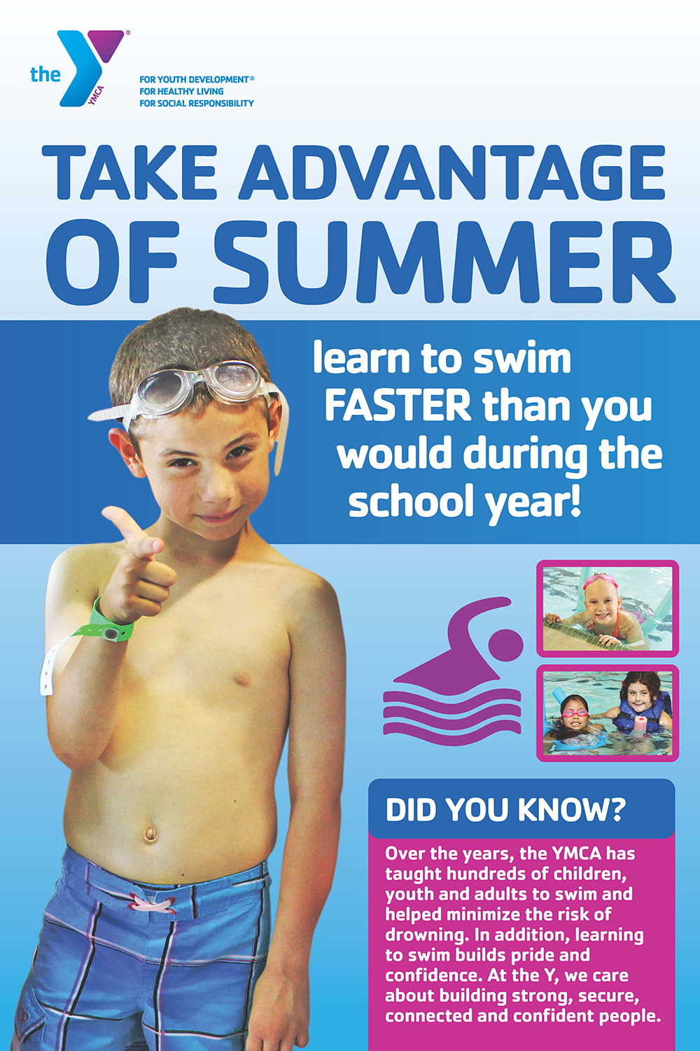
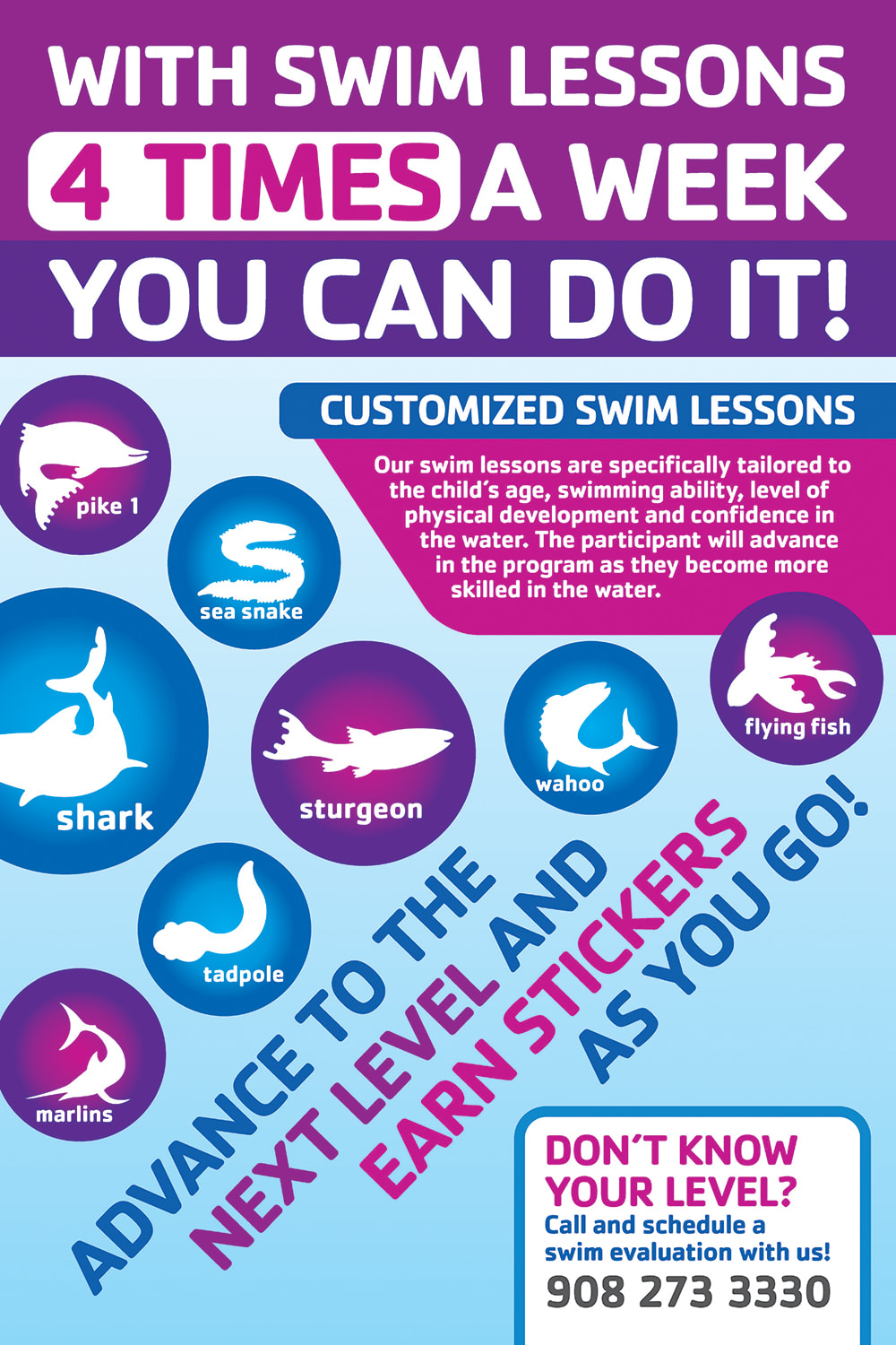
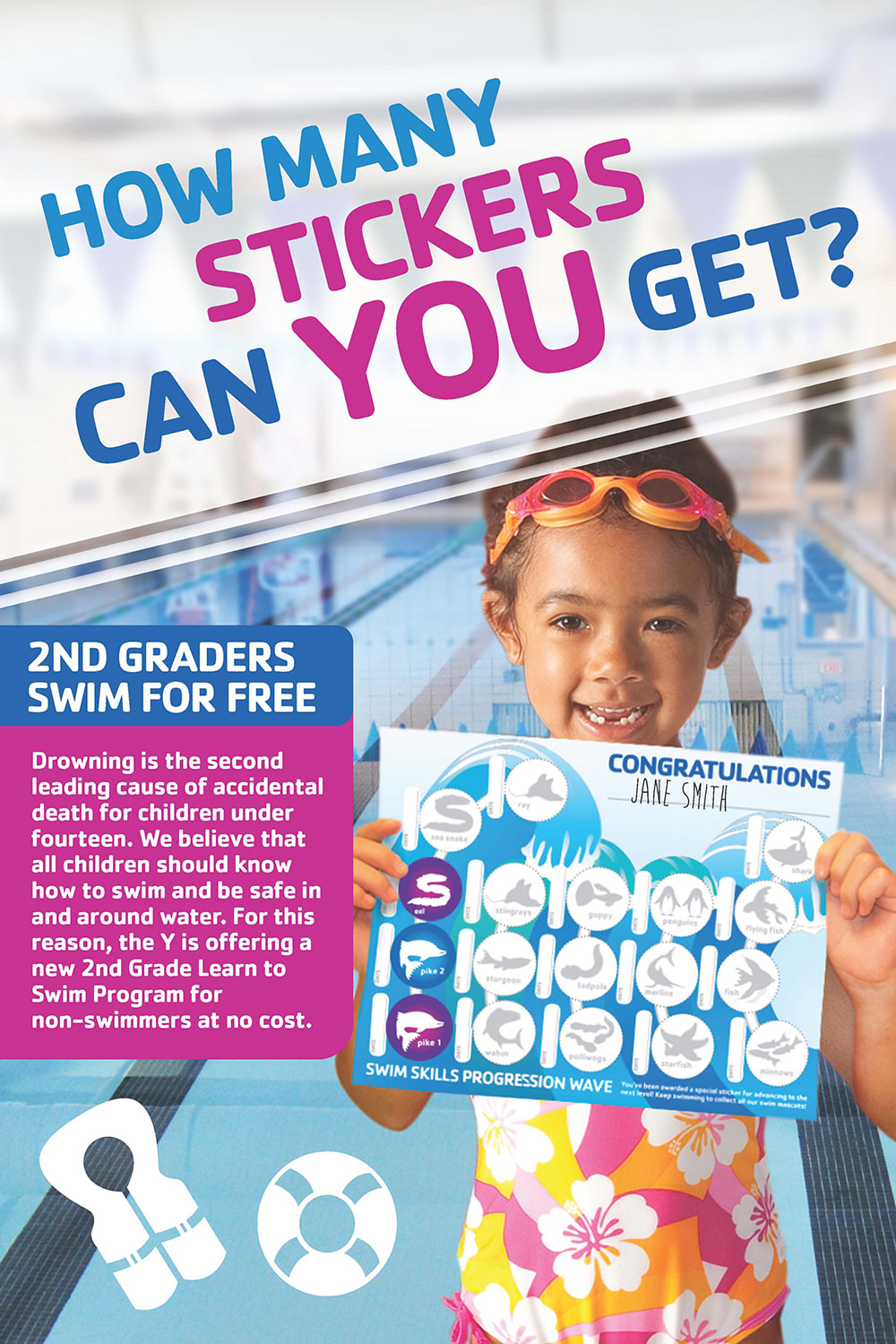
One of the Summit YMCA's largest programs is their swim lessons program because they strongly believe that every child should learn the important skill of swimming—so much so that they even offer free swim lessons for 2nd graders. To help promote this, I designed facility signage to uplift the program and incentivize participation.
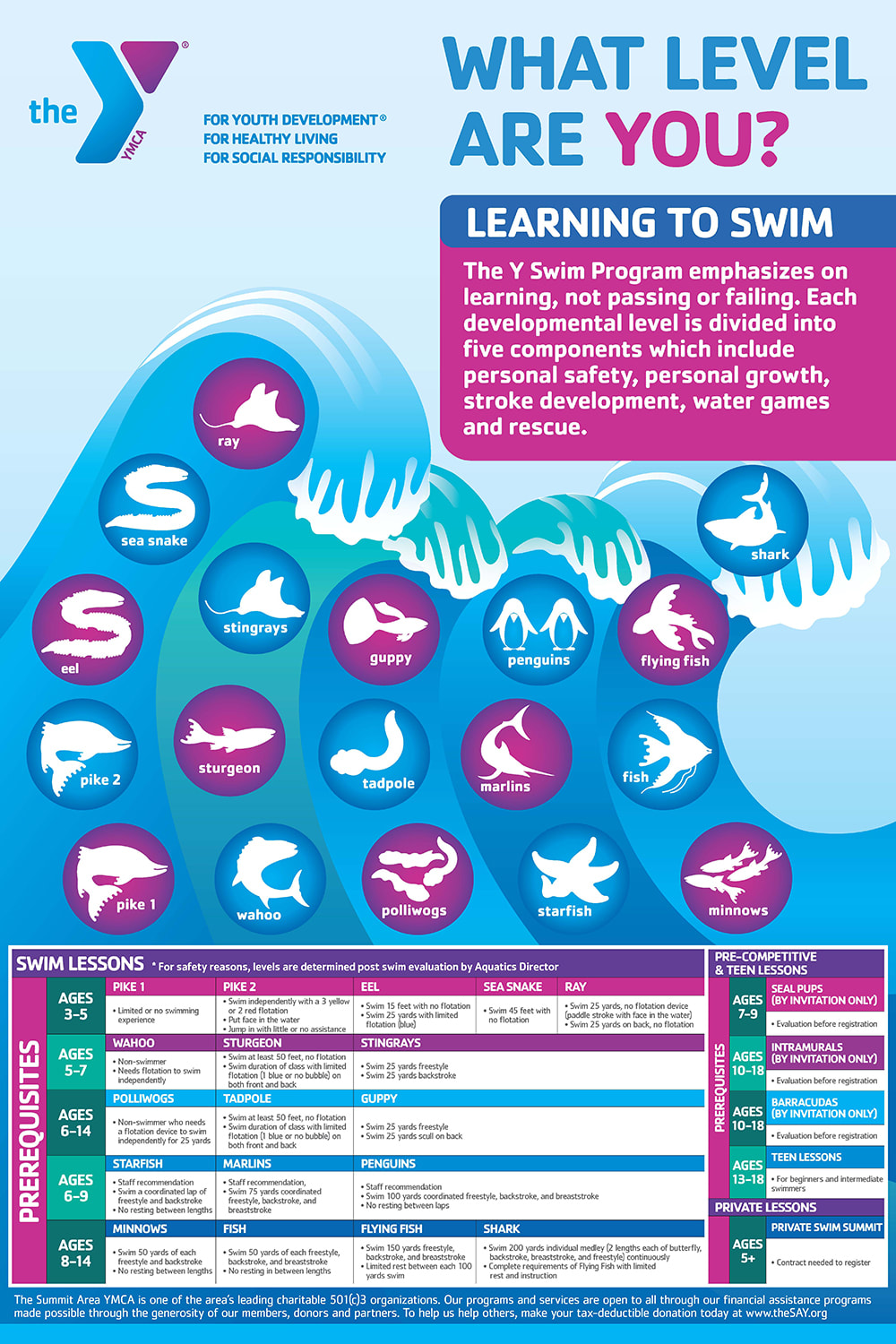
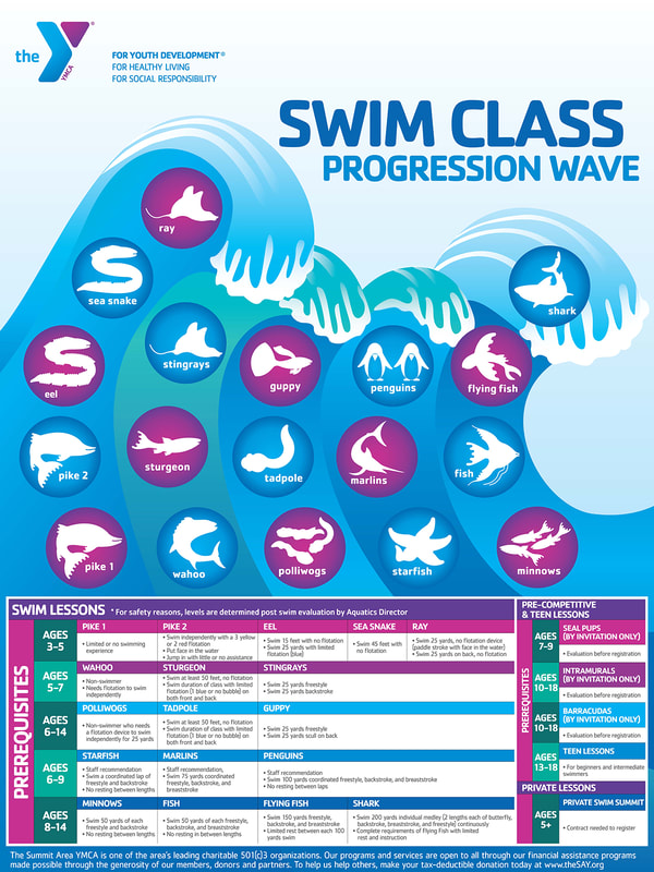
Swim lessons at the Y were originally based on a tiered system named according to various aquatic animal mascots. To encourage participation and provide clarity to members on the swim level progression, I worked with the Aquatics Director and learned about the intricacies of the program, how it worked, including feedback and questions that parents of swimmers often asked in order to best inform my design decisions.
Swim lessons at the Y were originally based on a tiered system named according to various aquatic animal mascots. To encourage participation and provide clarity to members on the swim level progression, I worked with the Aquatics Director and learned about the intricacies of the program, how it worked, including feedback and questions that parents of swimmers often asked in order to best inform my design decisions.
|
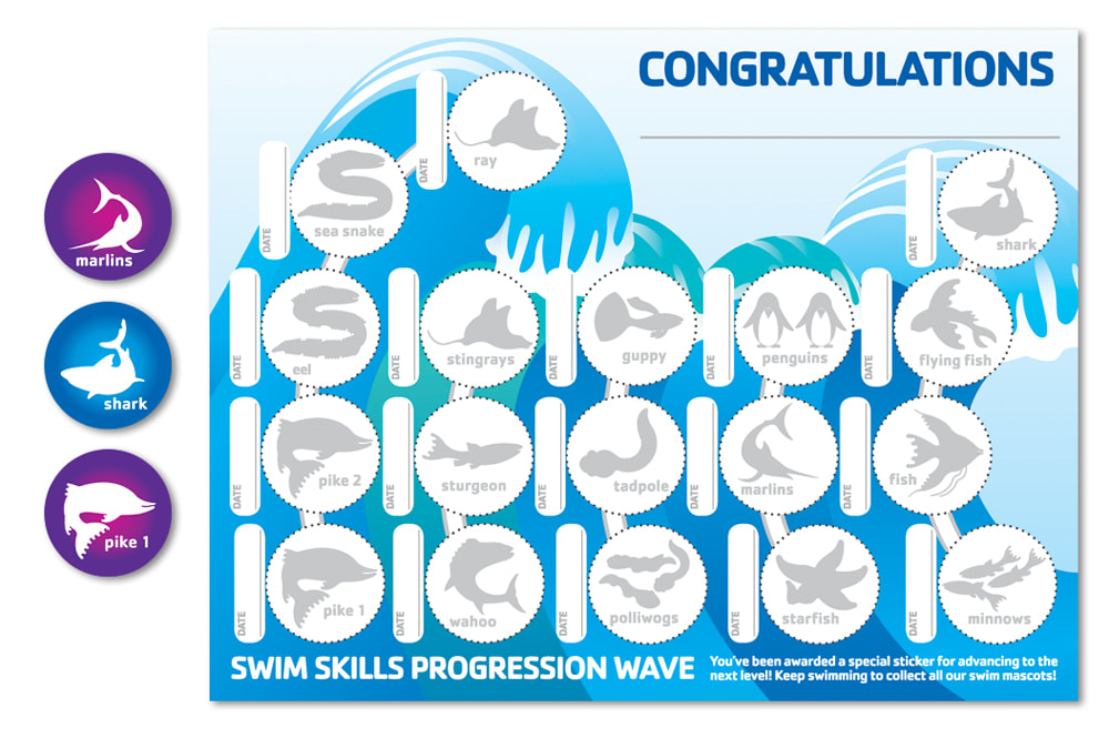
I loved working on this project because of its multifaceted elements. The project involved a new sticker system, where young swimmers could collect each mascot sticker as they advanced to the next swim level. I designed the sticker certificate, the stickers as well as four large posters that adorned the walls of a hallway located by the back entrance of the facility. This hallway was frequented by swimmers and their families since it lead to the locker rooms and swimming pools.
|
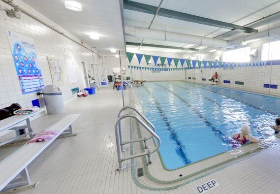
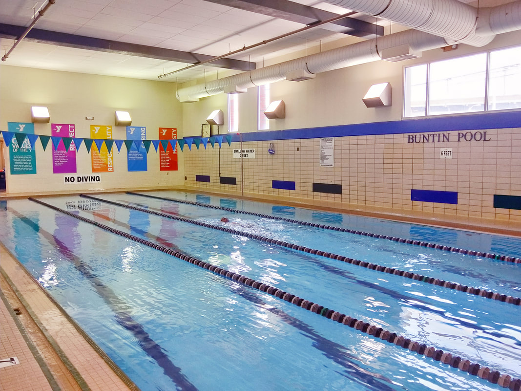
I also designed a large Swim Class Progression Wave sign (of which one of the posters were based on) that was installed next to the Buntin Pool, one of the swimming pools where most youth lessons took place. We strategically placed the sign near the bleachers for easy reference to parents and family, who typically waited there during swim lessons.
CORE VALUES BANNERS
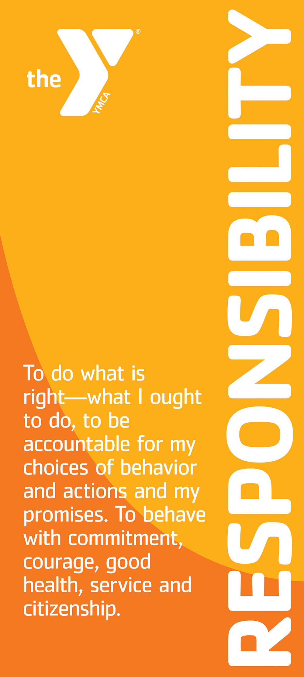
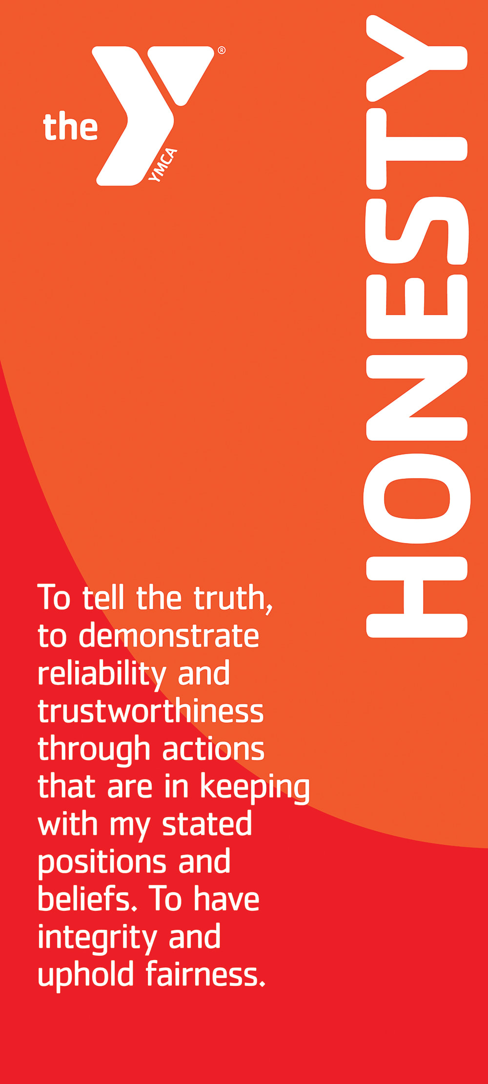
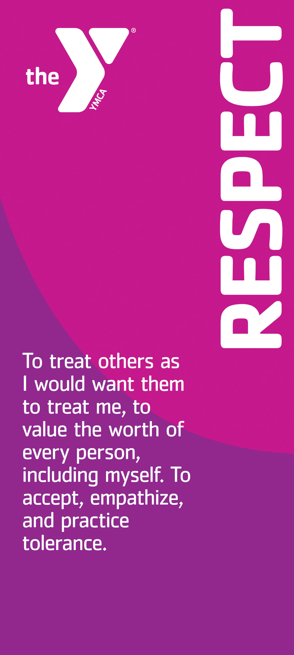
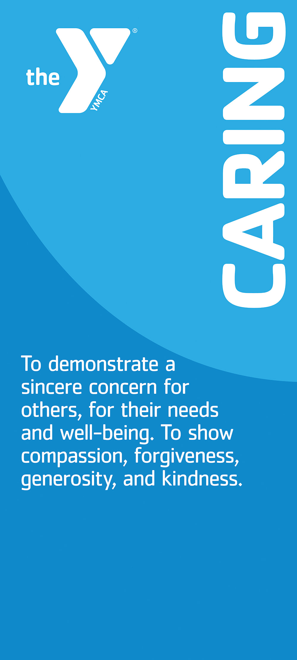
Instructors at the Y are required to include the teaching of the Y's 4 core values into their lesson plans and curriculum, from swimming lessons to summer camps, to ensure that today's youth can become successful, well-rounded adults in the future. I learned that the popular idea of the Y being just a gym and swimming pool facility often discounts the many other important skills that youth can learn during their time at the Y.
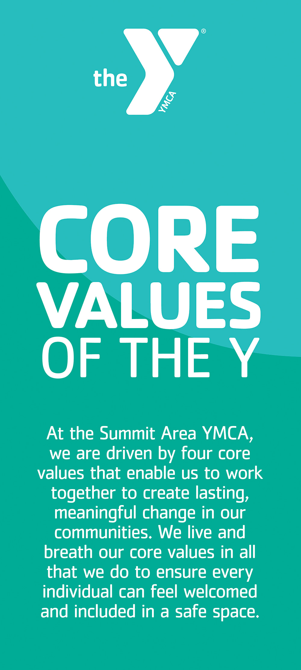
To help ameliorate that perception, I designed a series of 5 banners detailing the Y's 4 core values which are displayed by the Buntin Pool. The design and placement was aimed at young swimmers, parents and their families, so that they may understand that they are not only learning how to swim during their lessons, but also the 4 core values of the Y.
To help ameliorate that perception, I designed a series of 5 banners detailing the Y's 4 core values which are displayed by the Buntin Pool. The design and placement was aimed at young swimmers, parents and their families, so that they may understand that they are not only learning how to swim during their lessons, but also the 4 core values of the Y.
The design used the Y's brand colors, and the size and brightness brought a wonderful visual pop to the pool room.
Swimming Pool Hallway Installation
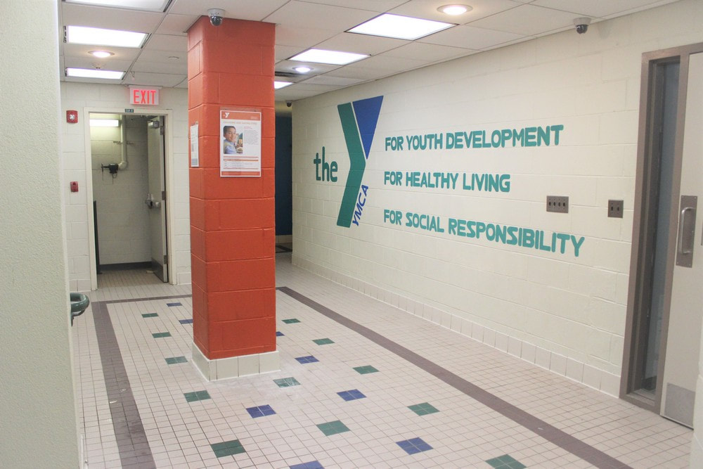
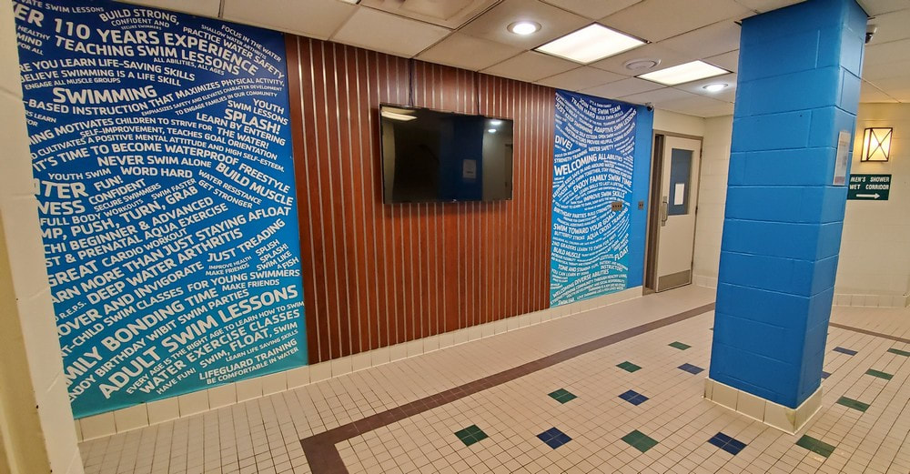
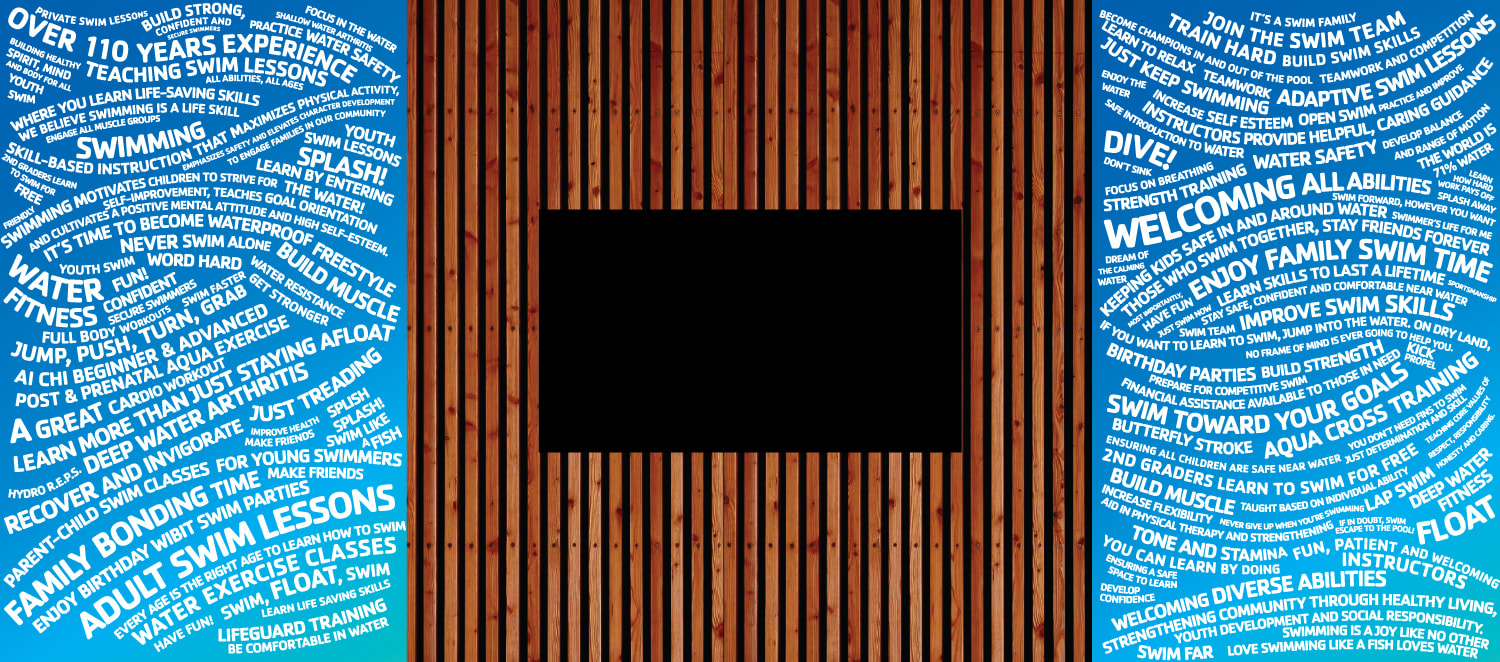
A special project I worked on for the Summit YMCA included the redesign of a hallway leading from the facility's locker rooms to the swimming pools. The redesign included repainting the walls and installing signage with swim facts and swim quotes to either side of a TV monitor. The monitor would feature slides with swim program factoids, cross-marketing other Y programs, highlighting SAY swim team swimmers and their achievements, upcoming event promotions, Y testimonial videos and much more. The wall's redesign aims to increase engagement with members, increase awareness about the Y's mission and cause, as well as providing useful information for swim related activities.
BEFORE
AFTER
To emulate the movement of water, I designed the text to undulate in a wave-like pattern throughout both panels. The relaxing gradient of dark blue to light blue (Y brand colors), the repainted pale blue wall and pillar, along with the cherry wood slat board, create a pop of color to centralize attention in an otherwise tame, cream colored hallway.
For more information about the Summit Area YMCA, visit their website at www.theSAY.org
With over 10 years of experience working with clients from the East Coast to the West, I am happy to help realize your art and design needs. From print materials like business cards, menus, brochures, facility signs or posters; to rebranding design and digital ad design, I'm here to help bring your ideas to life. Learn more about me.
