Identity and Business Card Design
|
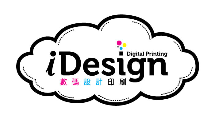
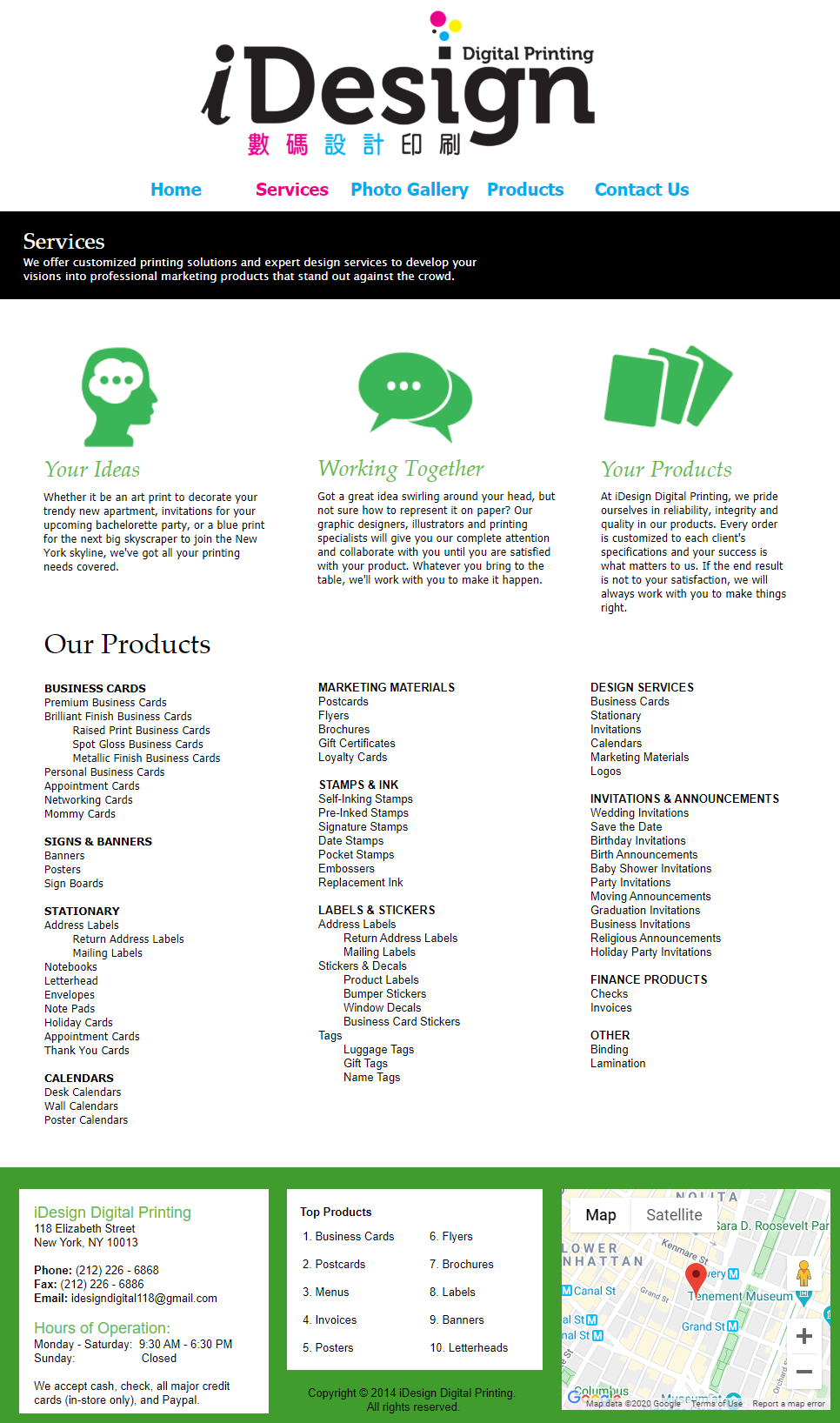
In redesigning the iDesign Digital Printing's logo, I had to consider two main things: purpose and audience. The goals of the new logo were that it needed to be innovative, modern, and easy to read. The company is located in downtown Manhattan, on the border of Chinatown and SoHo. Many of their clients are from the tri-state area, and many speak either Chinese or English.
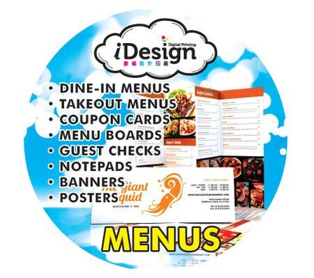
At the owner's request, I retained some elements of the original logo, specifically the "i" in iDesign. I updated the fonts and included a sans serif Chinese font for a more contemporary style. I intentionally chose its new logo colors to be cyan, magenta, yellow and black, which are the 4 basic colors used in printing. The circles coming out of the i in Design represent ink printing, in the CMYK colors. The surrounding cloud is indicative of the digital nature of the business, through design and its printing processes. |
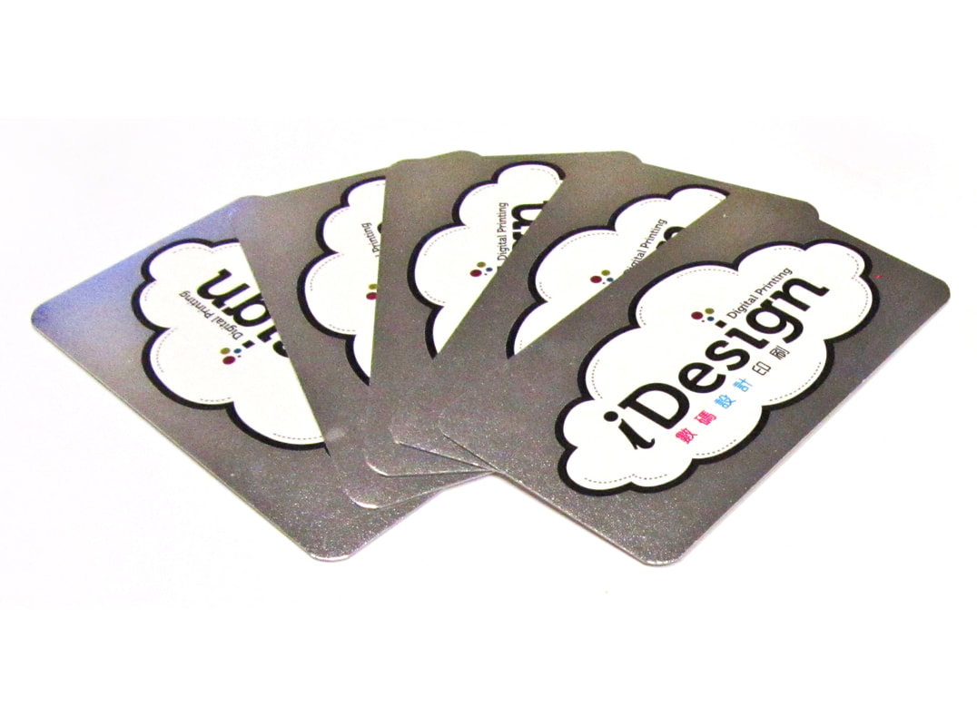
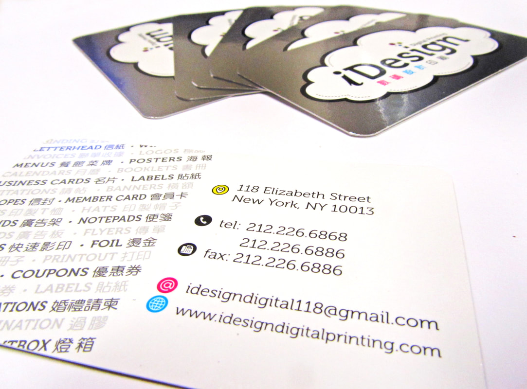
For the iDesign business card, I included silver foil printing around the logo, creating a sleek look and feel that alludes to the company's state of the art digital printing processes and efficiency in service. On the back of the card, I used simple icon art to relay the company's contact information, as well as a patterned text detailing the company's products in English and Chinese.
Indoor Lightbox Signage
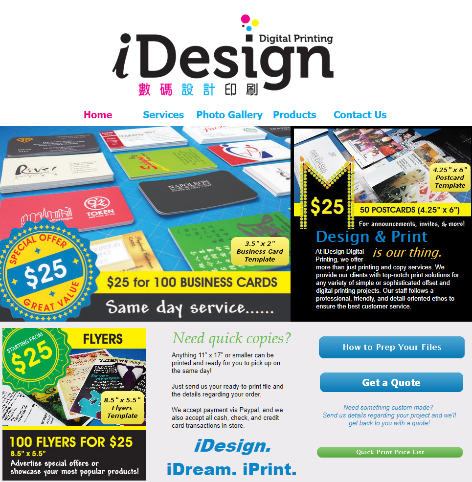
For more information about iDesign Digital Printing, visit www.idesigndigitalprinting.com
With over 10 years of experience working with clients from the East Coast to the West, I am happy to help realize your art and design needs. From print materials like business cards, menus, brochures, facility signs or posters; to rebranding design and digital ad design, I'm here to help bring your ideas to life. Learn more about me.

