|
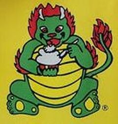
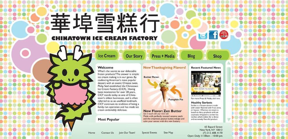
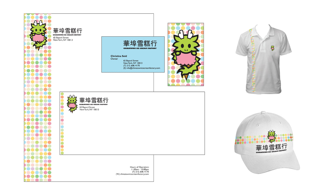
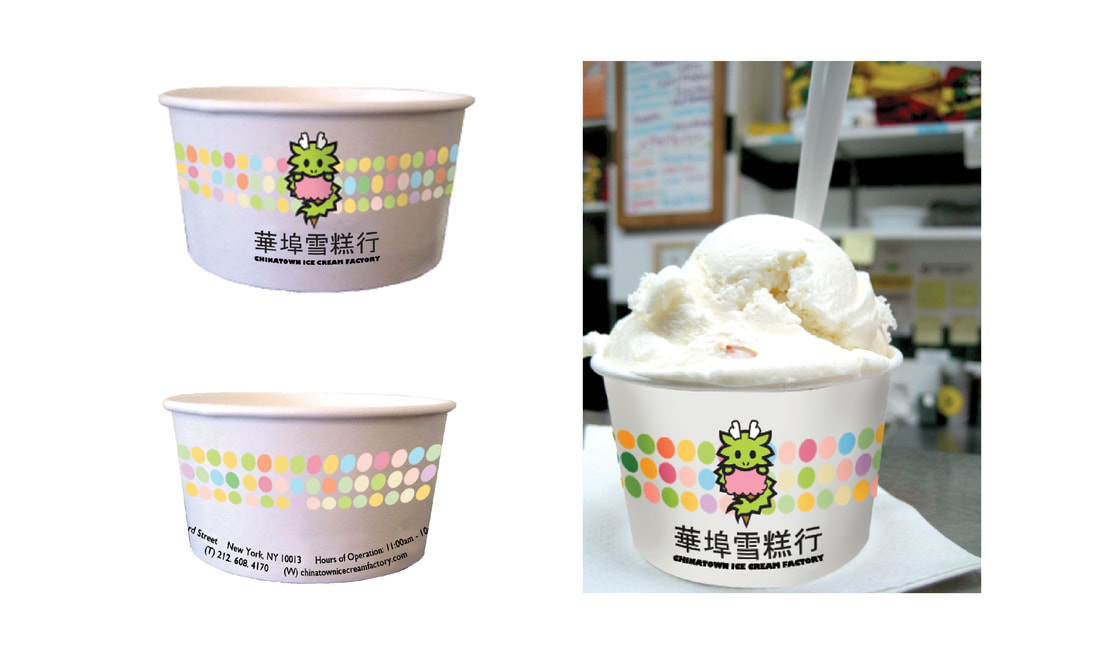
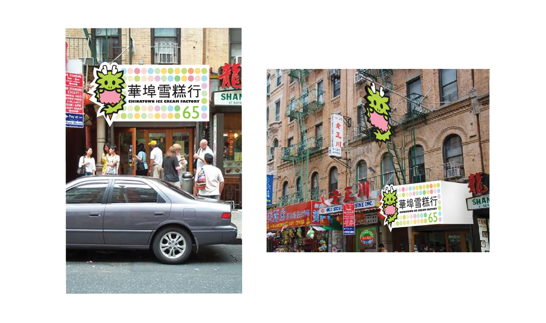
The Chinatown Ice Cream Factory (CICF) is a place I frequented as a child, and return to with a heart of nostalgia as an adult. When choosing a businesses for a hypothetical rebranding project, I thought of the CICF. (Maybe I was craving ice cream at the time?) In the redesign, I updated the art for the dragon itself, paying homage to the original logo's concept of a dragon eating ice cream. The shapes and lines are cleaner and more symmetrical, while various pastel circles alluding to the many different ice cream flavors they offer, are used in conjunction with the logo in other print materials and merchandise.
|
I created a logo, website, letterhead and envelopes, business cards, apparel as well as exterior signage. I really had a lot of fun with this project, because it made me think about how to maintain a brand identity across various materials and applications. (Plus, I love the colors, and because well...ice cream).
For more information about the Chinatown Ice Cream Factory, visit www.chinatownicecreamfactory.com
With over 10 years of experience working with clients from the East Coast to the West, I am happy to help realize your art and design needs. From print materials like business cards, menus, brochures, facility signs or posters; to rebranding design and digital ad design, I'm here to help bring your ideas to life. Learn more about me.
